
Item No.
01. Research
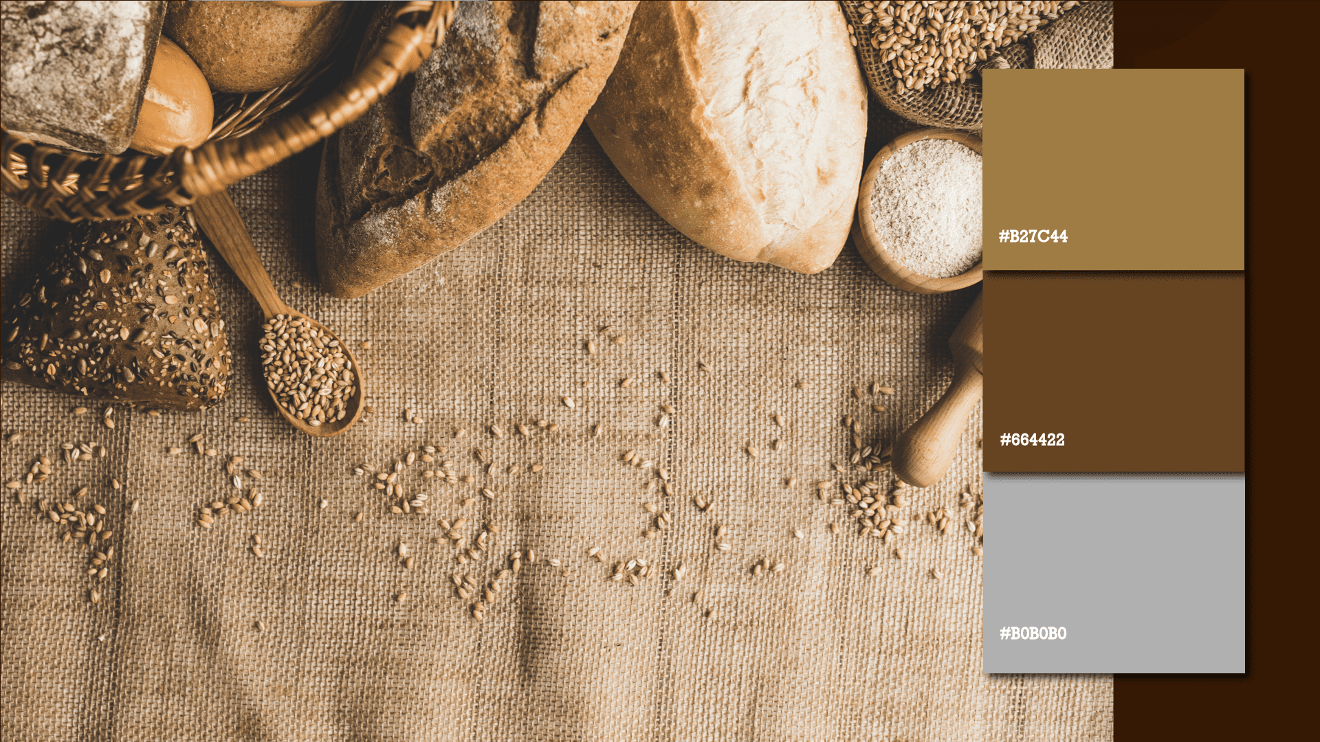
In-depth research on the artisanal bread market and consumer preferences, focusing on values such as tradition, quality, and authenticity to guide the creation of the brand identity.
Item No.
02. Design
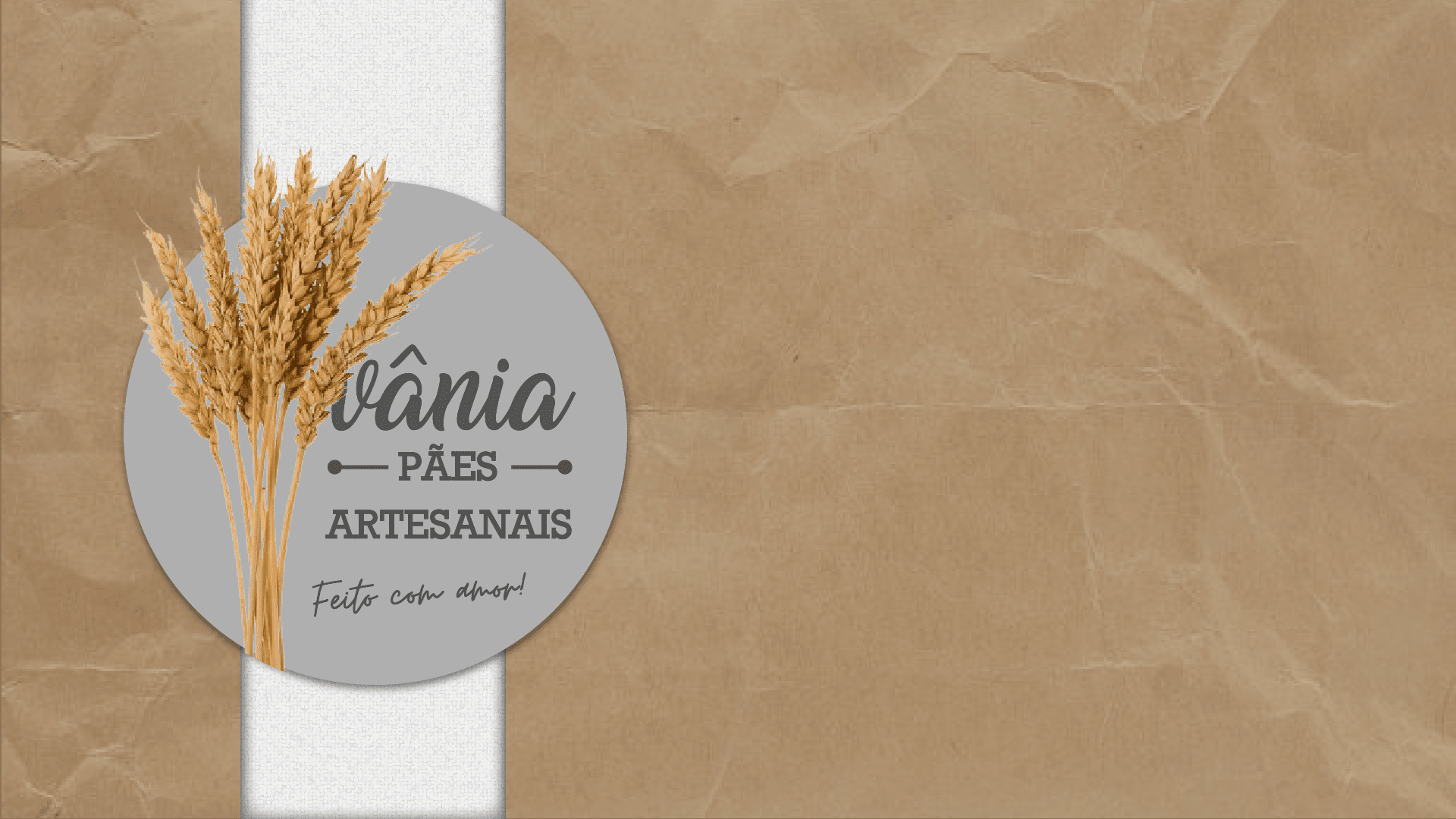
Development of a visual identity that reflects the handcrafted essence of the brand, combining rustic elements with a modern and clean style to stand out in the market.
Item No.
03. Develop
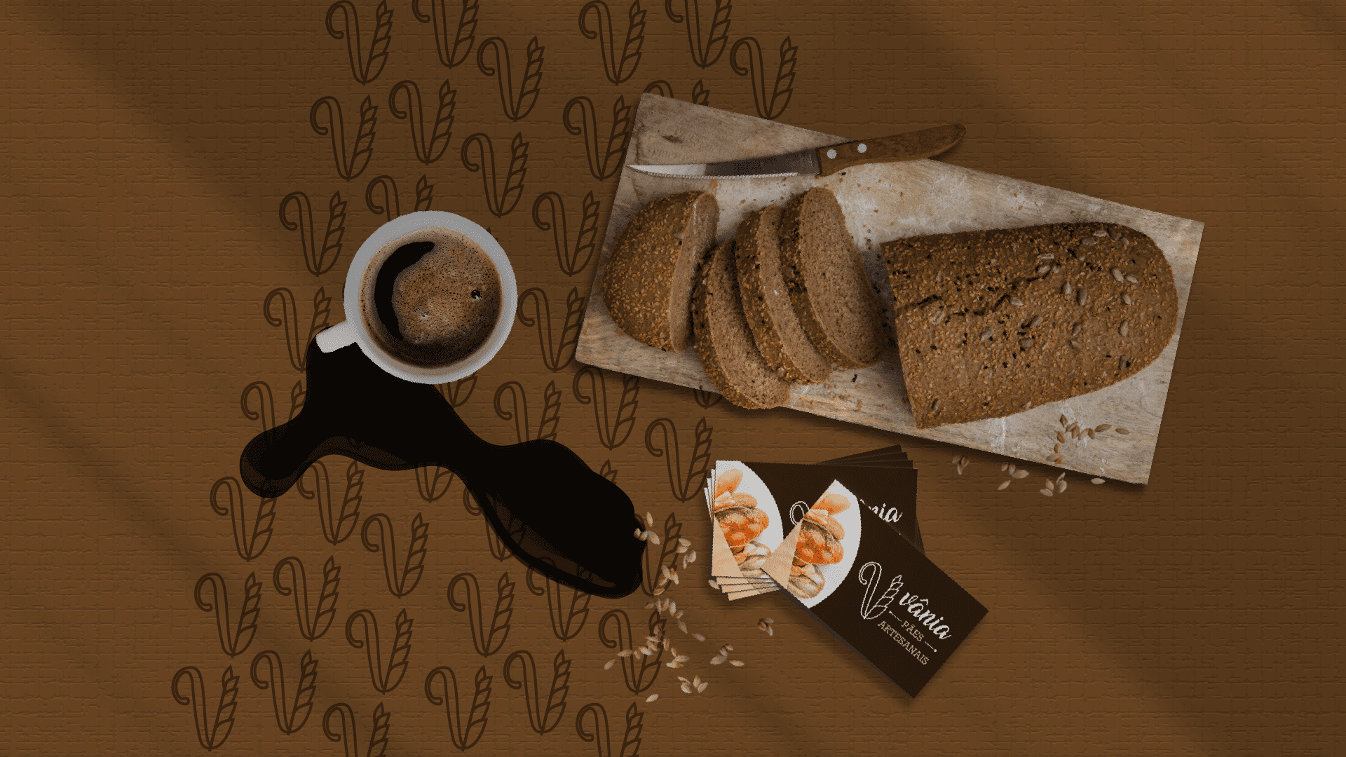
Application of the brand across various materials, ensuring consistency and adaptability in packaging, signage, and communication pieces.


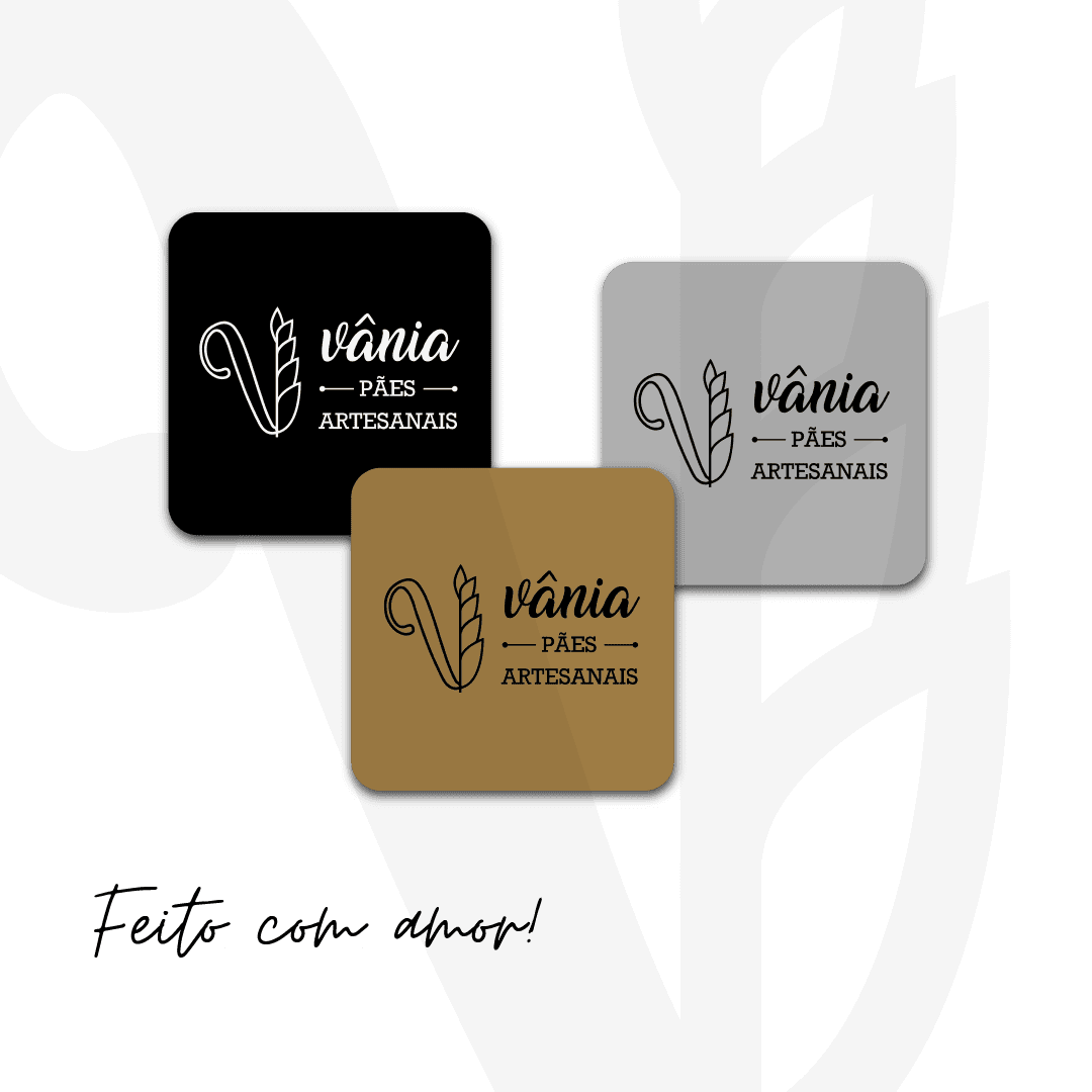
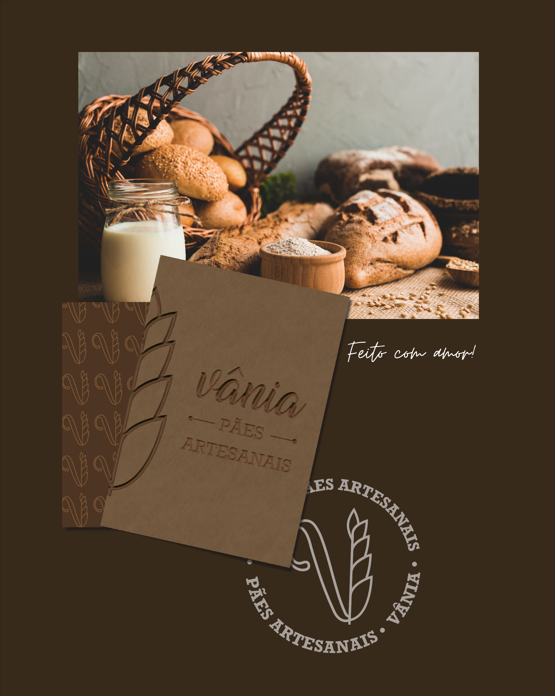
The creation of the Vânia – Pães Artesanais brand was the result of a thoughtful and multi-stage process that combined market research, creative exploration, and strategic positioning. From the start, the goal was to build a brand that could communicate the values of authenticity, dedication, and tradition that define true artisanal bread. The process began with extensive research on consumer behavior, local and international competitors, and trends in the handmade food sector.
This research revealed a clear desire from the public for brands that are transparent about their ingredients, respectful of tradition, and capable of delivering both emotional connection and product quality. These insights inspired the development of a brand identity that is warm, approachable, and rooted in craftsmanship. Every detail — from the logo concept to the typography, color palette, and graphic elements — was designed to create a visual language that tells the story of Vânia’s commitment to the art of baking. The result is a brand that feels familiar, trustworthy, and capable of standing out in a competitive market while remaining true to its artisanal essence.
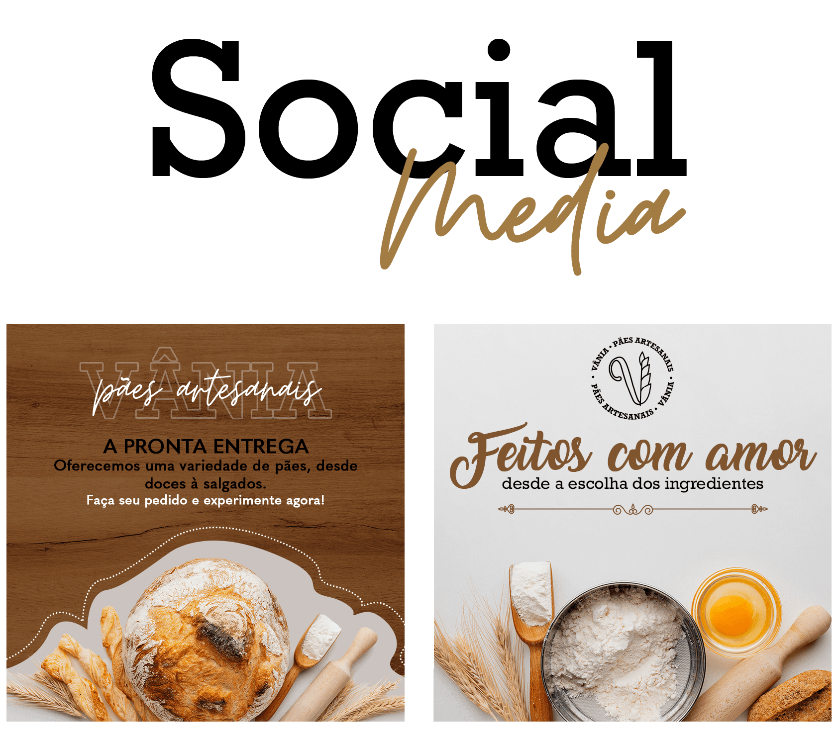
The visual identity created for Vânia was carefully adapted for digital platforms to strengthen the brand’s presence on social media and engage with a broader audience. The social media strategy focused on creating content that not only showcased the products but also reinforced the brand’s values — tradition, quality, and human connection.
Templates and visual patterns were designed to ensure consistency across posts while allowing flexibility to highlight seasonal products, baking processes, and behind-the-scenes moments. The tone of voice was developed to be friendly and inviting, reflecting the warmth of the brand and encouraging interaction with followers. Every element, from photography style to typography use in posts and stories, was aligned with the overall brand identity, creating a strong and memorable presence in the digital space.